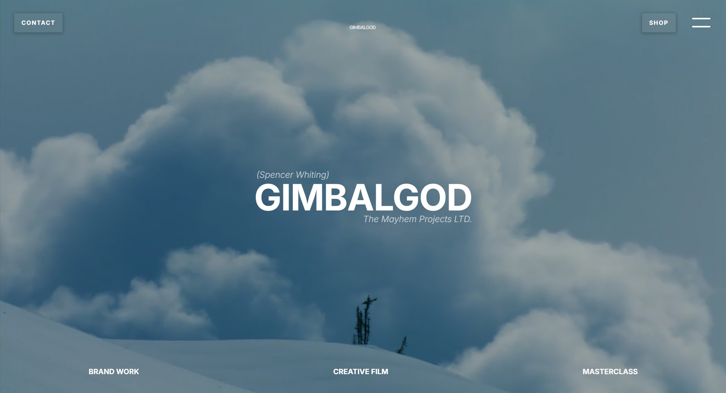
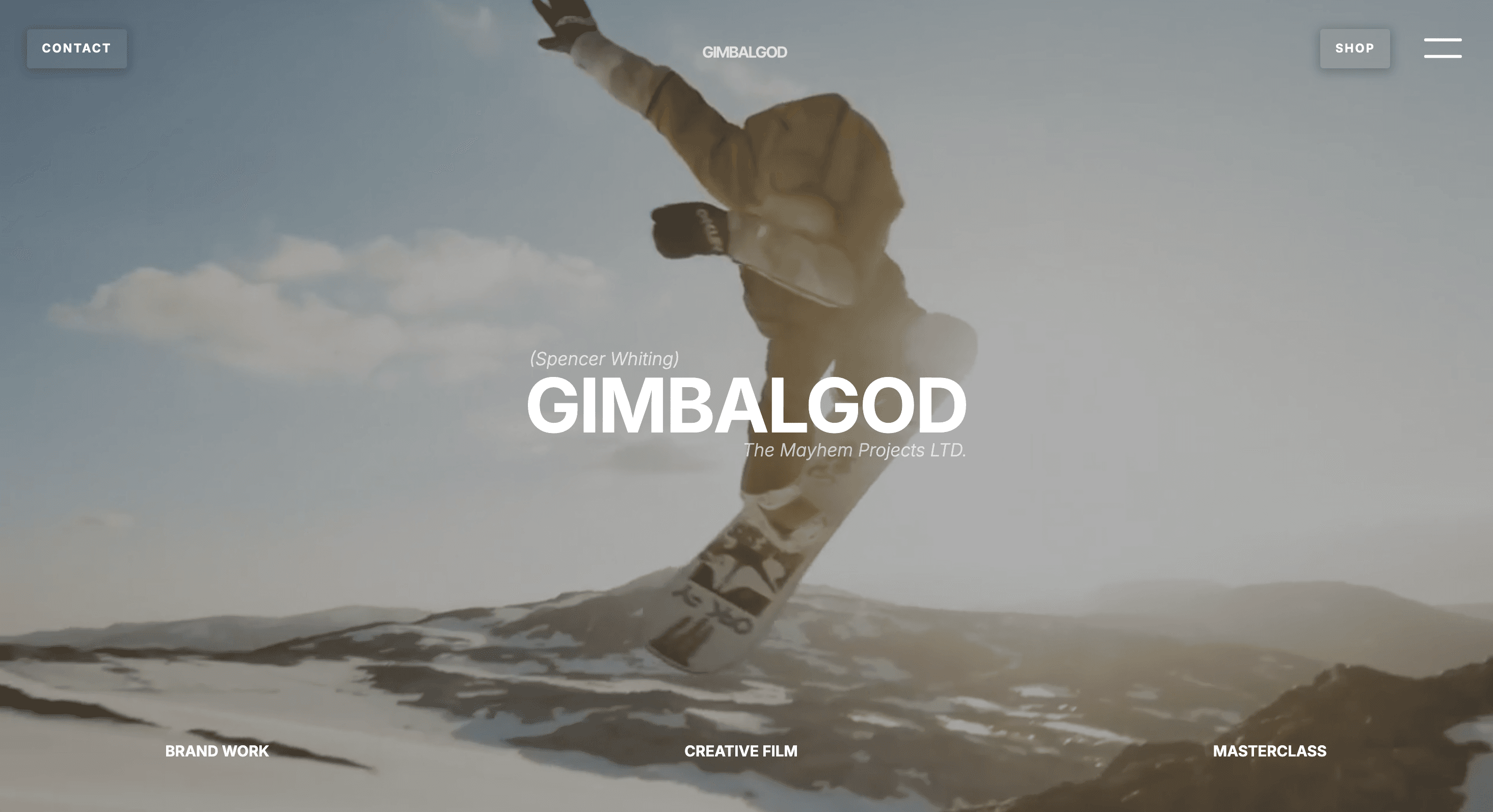
Gimbal God, otherwise known as Spencer Whiting, is a prominent figure in the snowboarding industry. Brands like Oakley, NBC, Toyota, and Monster have called upon Spenny's unique talents to produce insanely high-quality videography. Spenny called upon the YOSH team to make him a website that reflected his brand's quality and showcased it in a way that was intuitive, enticing, and as exhilarating as the content he creates.
Client
Gimbal God in SLC, Utah
Role
Website Design Team
Year
2024
The Challenge
YOSH designed the website for Gimbal God.
Gimbal God needed:
A website that stands out and invigorates its users to go out and experience life
A Shopify site that matched the modernized main website
To convey to brands and future clients the quality of his work
To have a platform to showcase some of his best work "at a glance"
To be able to sell his masterclass from the website
To have exclusive content reserved for members of the site
User-Centric CMS
How do you showcase hundreds of hours of content on a webpage?
What does the user want to see from the huge footage archive when every user is unique?
These were tough questions and the team decided on a CMS (content management system) and short video files that enable lighting quick previews upon a hover of the mouse.
This enables the user to determine if they want to click on the link before they click it. Essentially we gave the users the power to look into the future. Pretty cool huh?
This superpower was created through the intersection of the client's need to show their high-quality content and the user's need to gain an understanding of the content in the quickest time possible.
Designing to Convey Brand Identity
Brand Mission
Let the content and art style of the client speak for itself and support it through an elegantly simple and modern interface that leads the user to focus on the client's work.
Brand Tone of Voice
Aligned with the culture of snowboarding. Lots of comments with references to snowboarding such as terms like "Send it!" or videos framed as snowboards.
Color Choices
The stark contrast between black and white leave the user completely focused on the color which triumphantly appears in the form of the client's work. Users are immediately drawn to the client's work and guided to view more through the easy-to-follow buttons and text surrounding all of the pages.
Through the use of black and white, we kept the client's goals in mind and stayed aligned to the mission, we chose simple, elegant, and focused.


Website Design
The first step after laying out the needs of the business, was creating the sitemap and user journey map. We proceeded to draft the website design in Figma. After reviewing with the client, Gimbal God, we began creating the vision in Webflow. We spent time optimizing the CMS and made sure every page had consistent branding and executed on its respective purpose.
We then optimized the user interface and user experience throughout the site. The result was a cleaner, more user-friendly site.
At the end of the project, the client's expectations were blown away. See the site for yourself:
Visit the live website
What makes the website successful?
A dynamic and inspiring landing page that immediately conveys the brand
Unique visual content that excites viewers to learn more
Intuitive User Interface / User Experience allowing for easy sales
Capabilities that allow users to do everything within the website
Consistent and powerful brand feel that stays with the user


Key Takeaways
The goal was to create a website that showcased Spencer's incredible work in the best way that a website could.
We stayed true to that mission and both the client and the YOSH team are proud of the result.